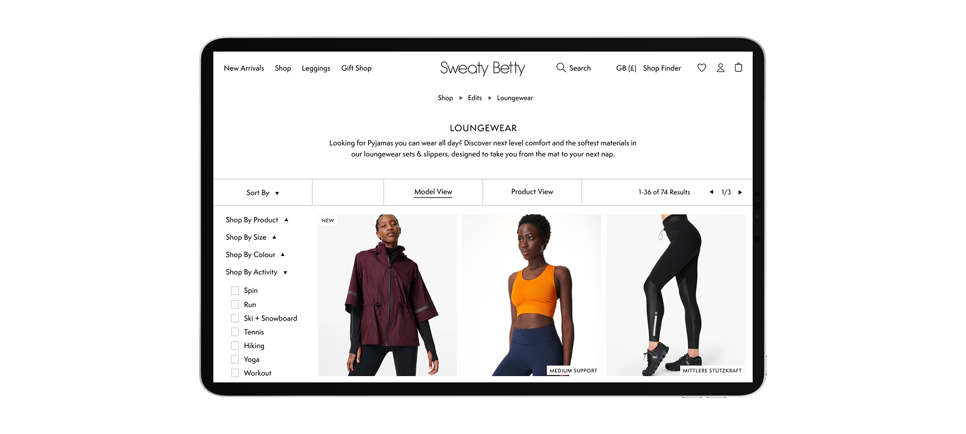
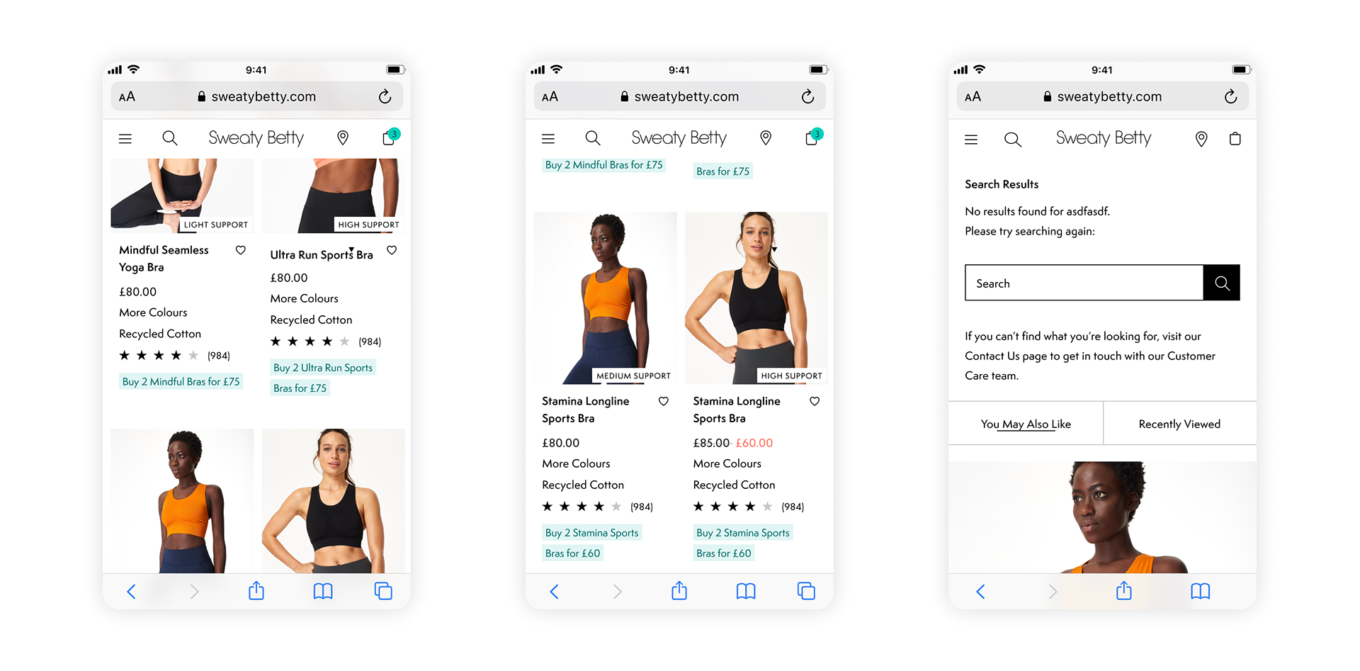
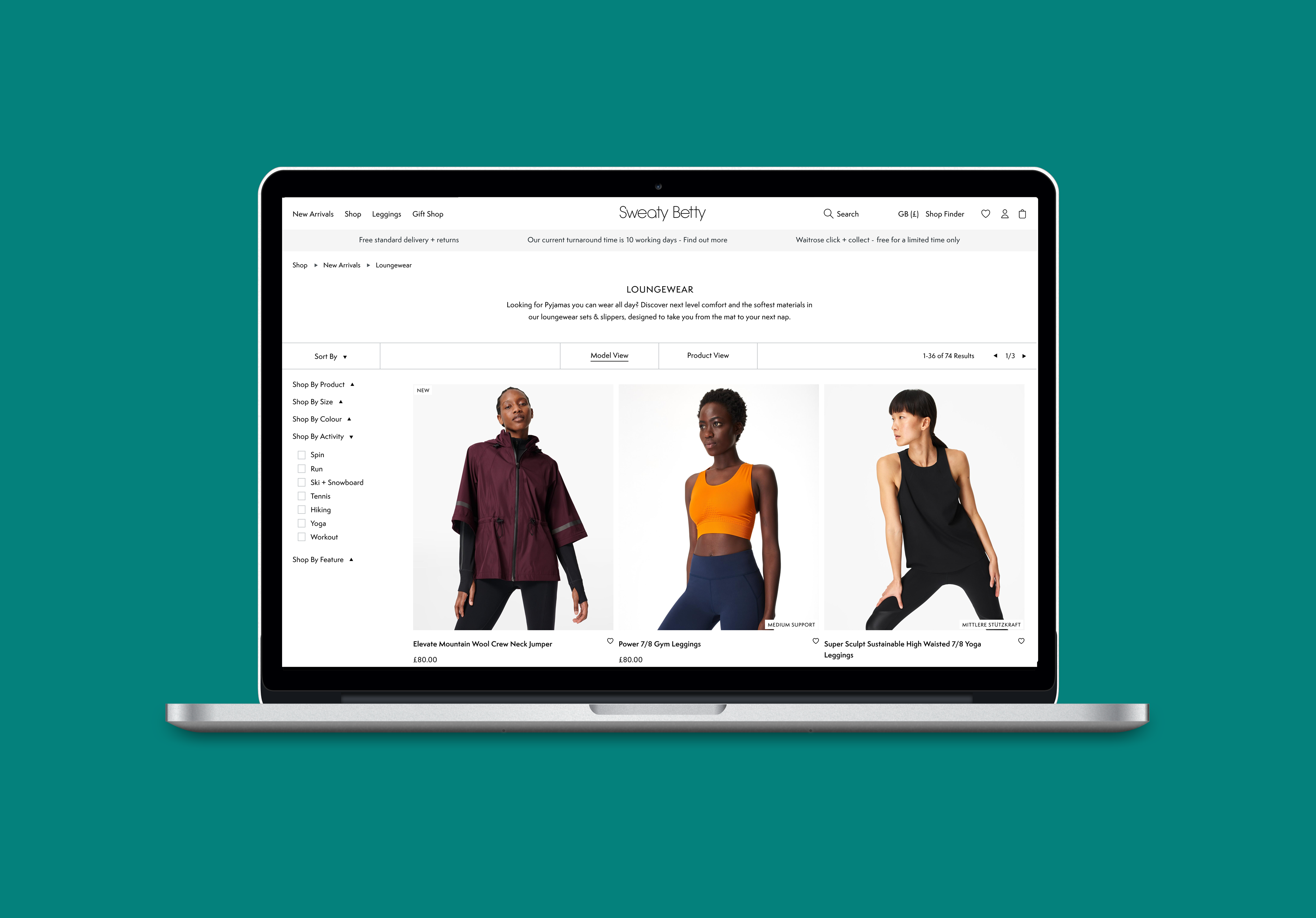
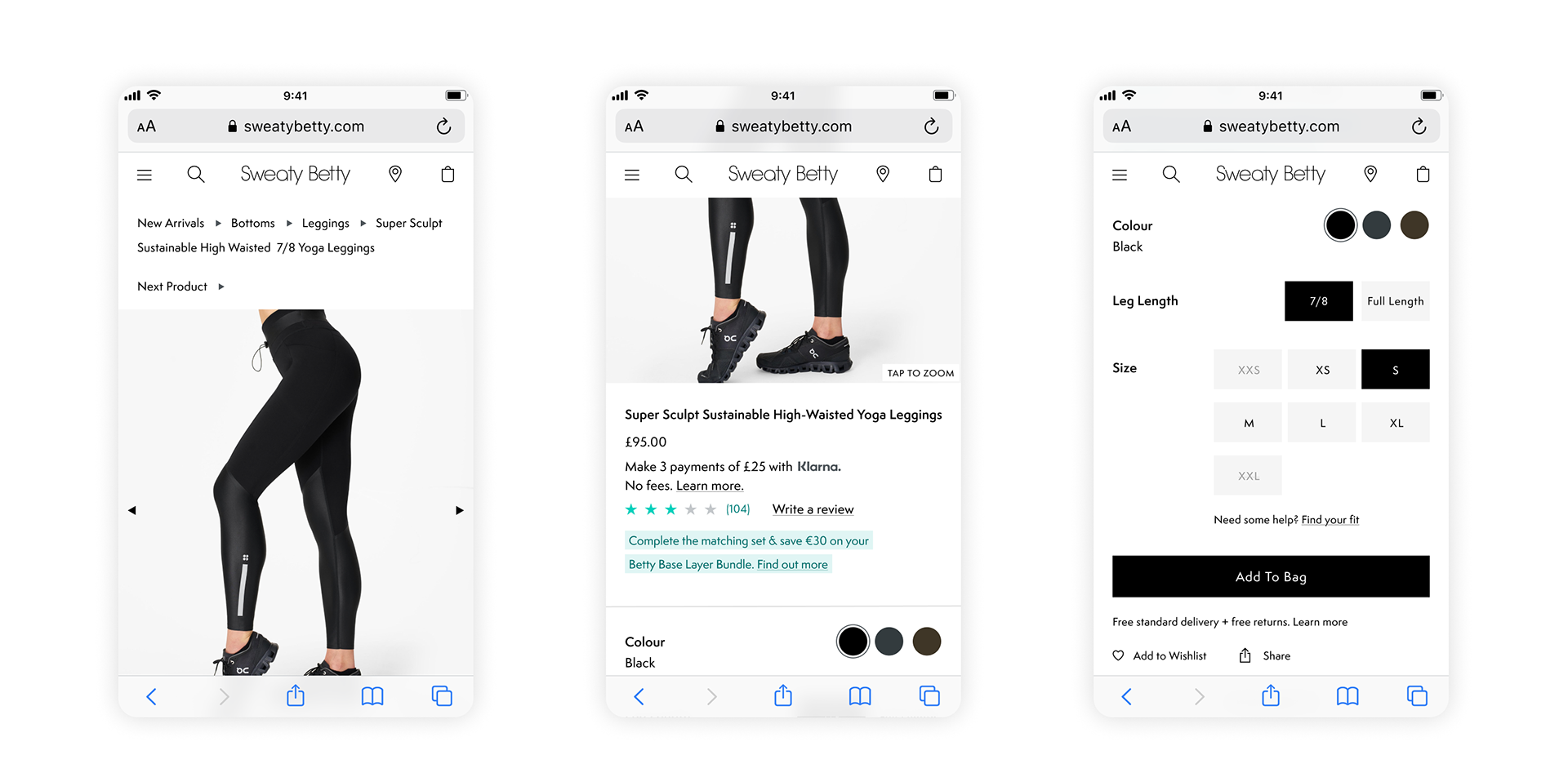
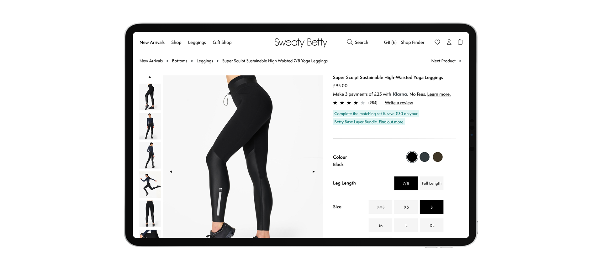
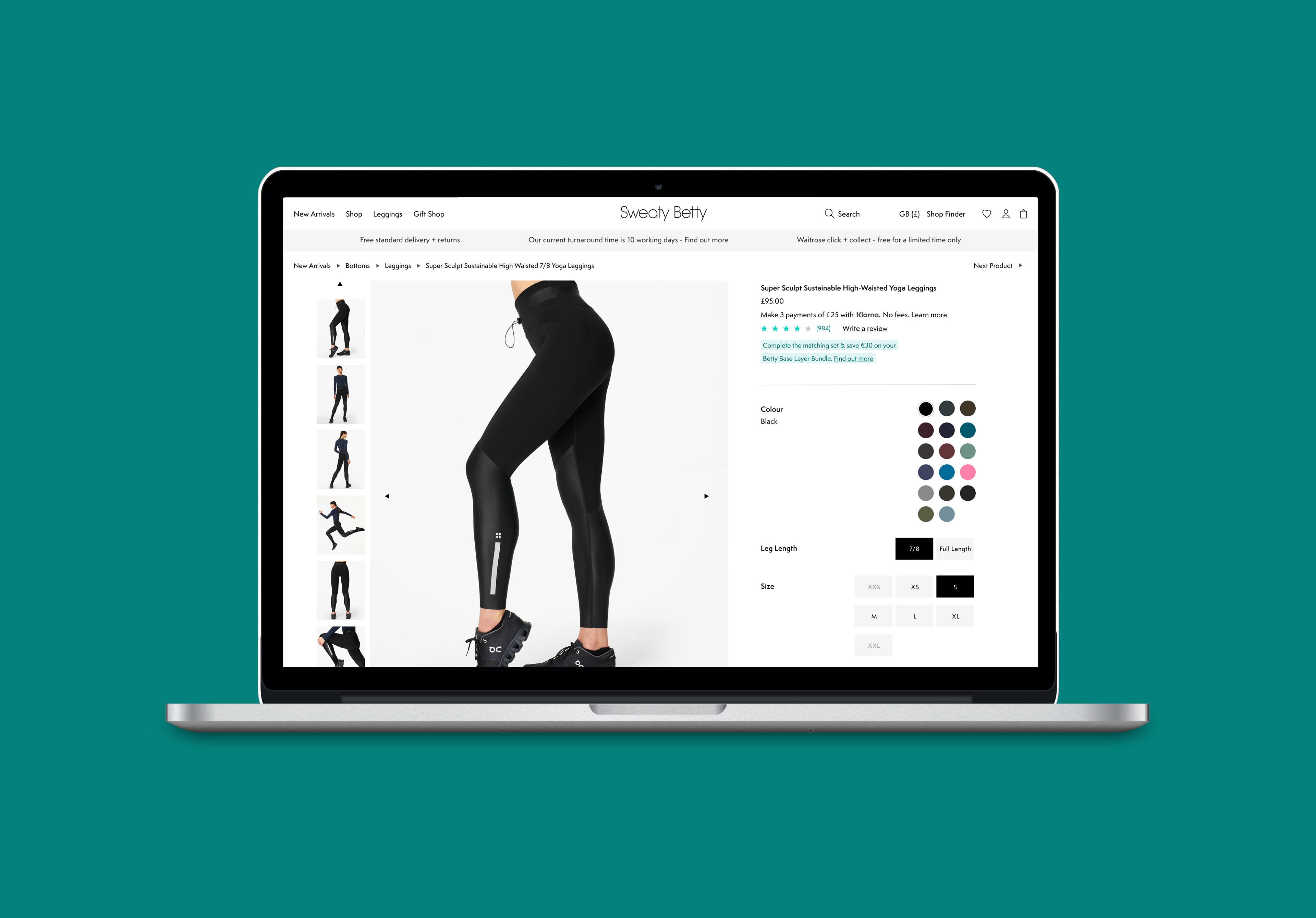
I was tasked with visually updating the product listing and product display pages on Sweaty Betty, by applying the business's new design system. This was an interim to a full redesign and build, as developer resources were limited. There was scope for small tweaks to the existing pages, for example to image sizes, margins and padding, colour and border styles, and swopping out of iconography. Overall I aimed to create more space and breathability, and give the experience a more premium and considered look and feel.
I was also aware that there were significant inconsistencies in the use of typography and colour, styling and placement of components, and low accessibility levels. These inconsistencies and pain points affected trust in the brand and limited the customer base - and therefore conversion rates, and I aimed to address these in my audit and application of the design system.
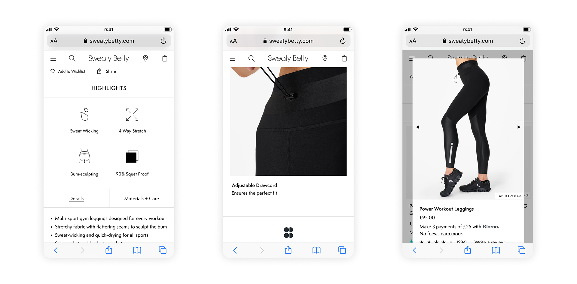
I noticed that the badges being applied to product imagery were all individually artworked by the in-house design team. Along with this being an inefficient way of working, it more importantly affected accessibility as the image scaled depending on the device, and therefore on larger devices I noticed the badges became pixelated and unclear to read. As we didn't have resource to hard-code new badges at this stage, I implemented a short term fix to address both accessibility and inefficiency. I created a set of badges and provided these as svg files to the engineer. I then worked with him on setting rules for size and placement across devices, and we built up a library that they could pull from, rather than having to request individually artworked images. And more importantly would always be clear to read and visually accessible, with alt text being applied to each label.