As Sweaty Betty was historically a bricks and mortar retail business, it made sense that they'd used Futura as their brand typeface, as well as a fluro pantone orange for their main brand colour. However both these key brand elements didn't translate well across their digital experience. Futura being historically a print-based typeface, and neon colours in general don't translate well on screen. These two factors made up the majority of the re-brand, inclusive of other smaller elements to be considered, such as changes to iconography and arrow styling.
I began the re-brand by identifying a few key pages onsite that could best reflect and represent any proposed changes. I looked at 3 different design options, creating a mini design system for each, which I then mocked up across these key pages. I utilised this to present and gather feedback from key stakeholders, and after a few iterations I had an approved brand update and the foundations for the design system.
I then set out to audit the site and searched for patterns that I could create components for. I created a style guide to help me organise the creation of the design system
colour
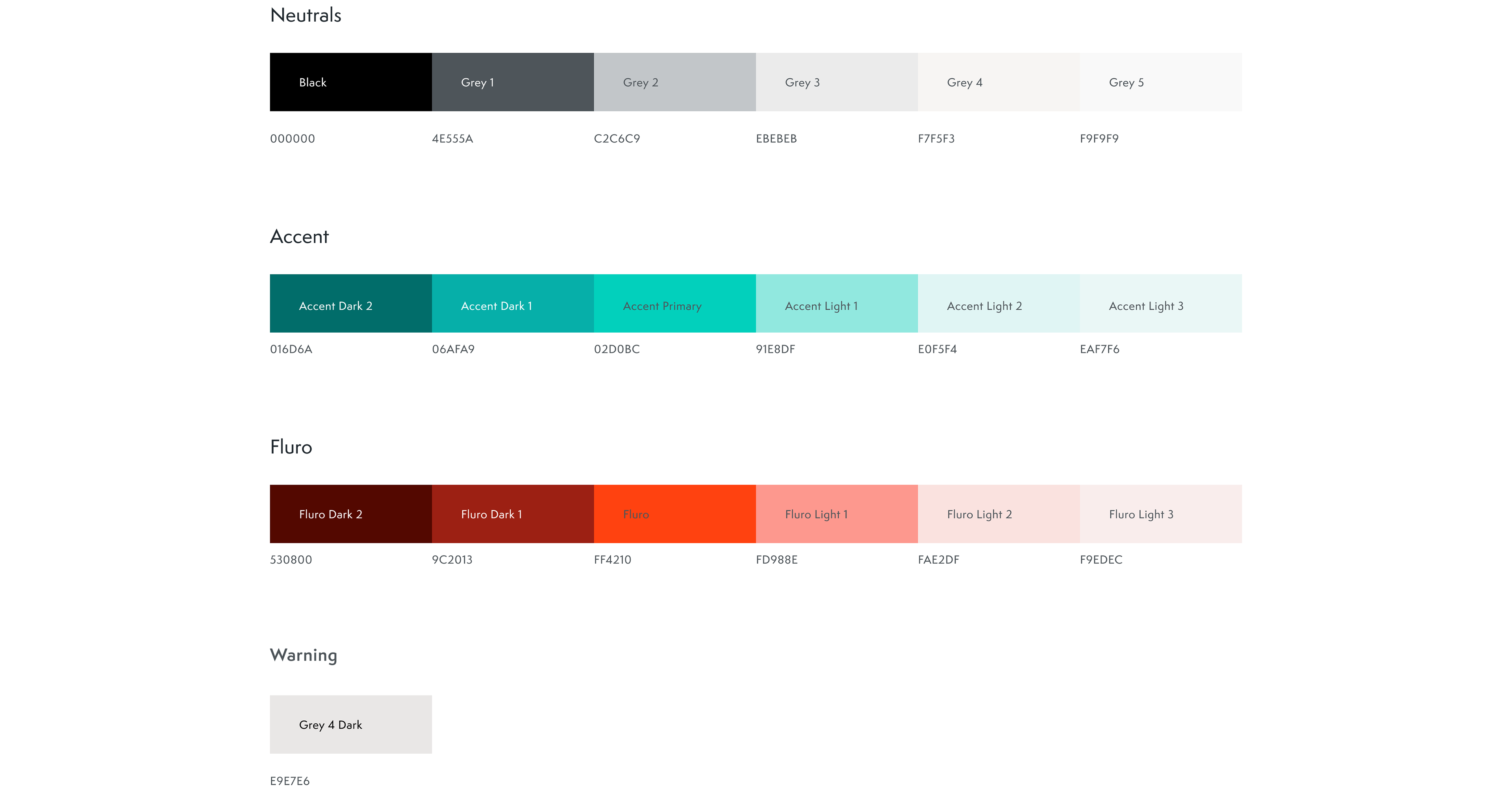
I was briefed to find a new digital-friendly brand colour for the site, to support the fluro-orange which would be used mostly for sale on site going forward. After a few rounds we settled on a bright teal, along with supporting tones and neutrals.
colour rules and accessibility
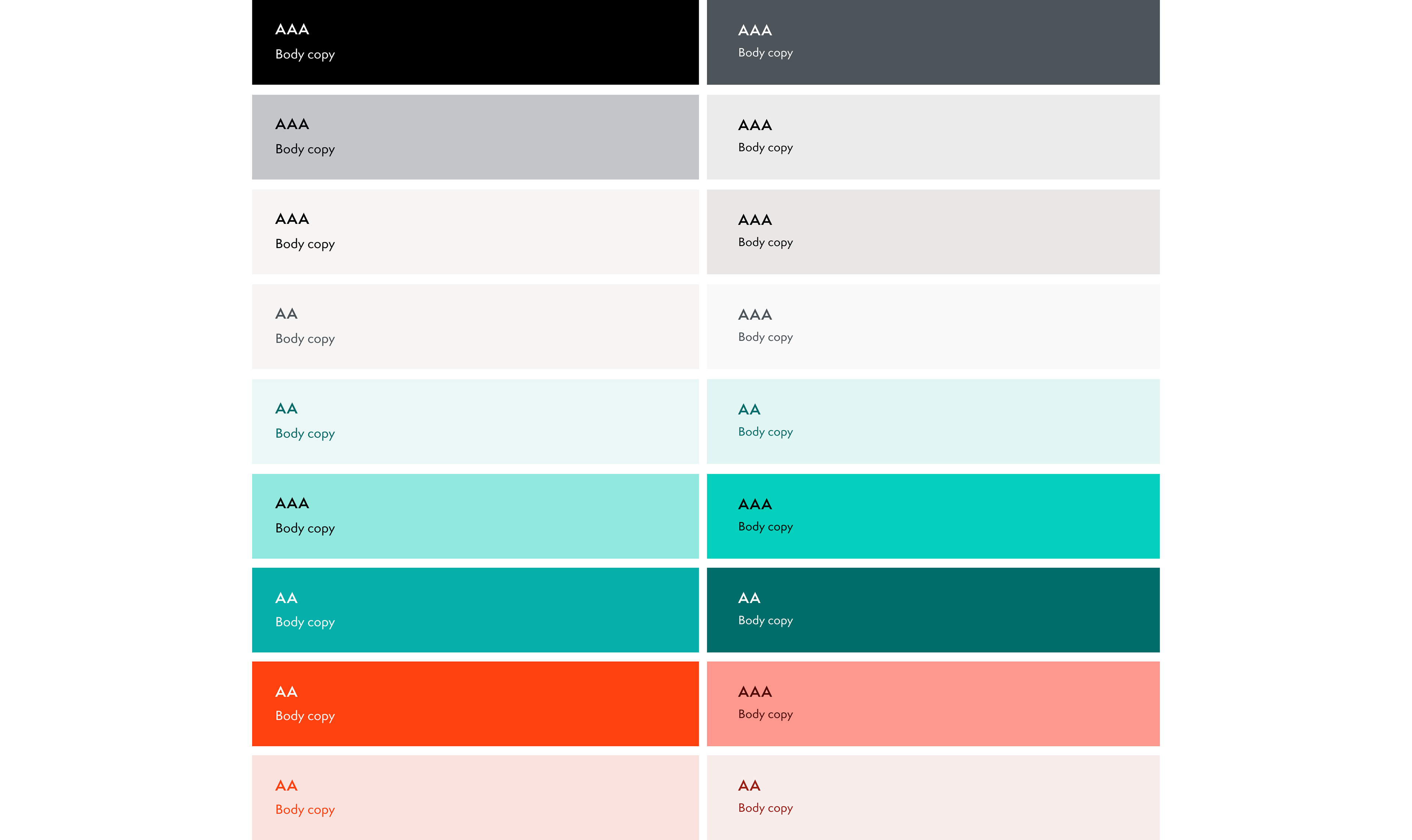
These are the guidelines for the colour combinations based on accessibility contrast standards.
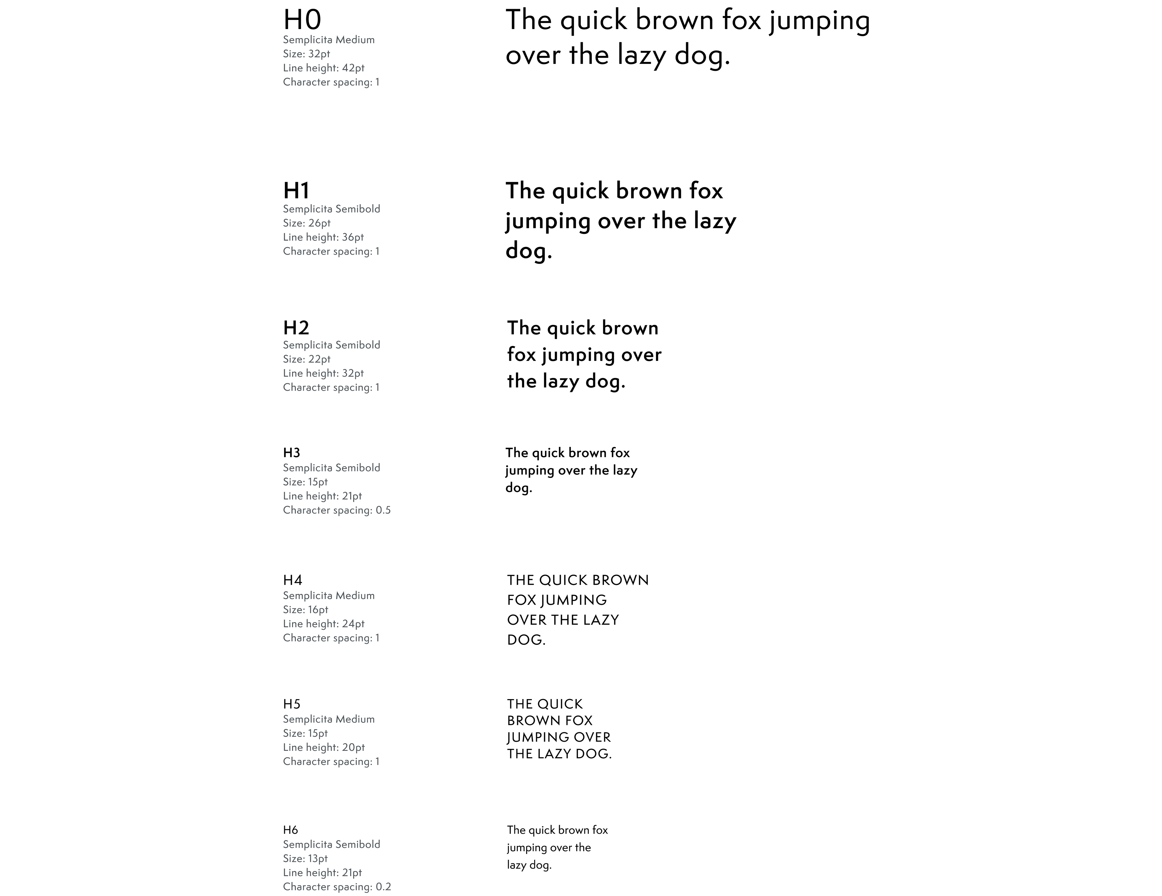
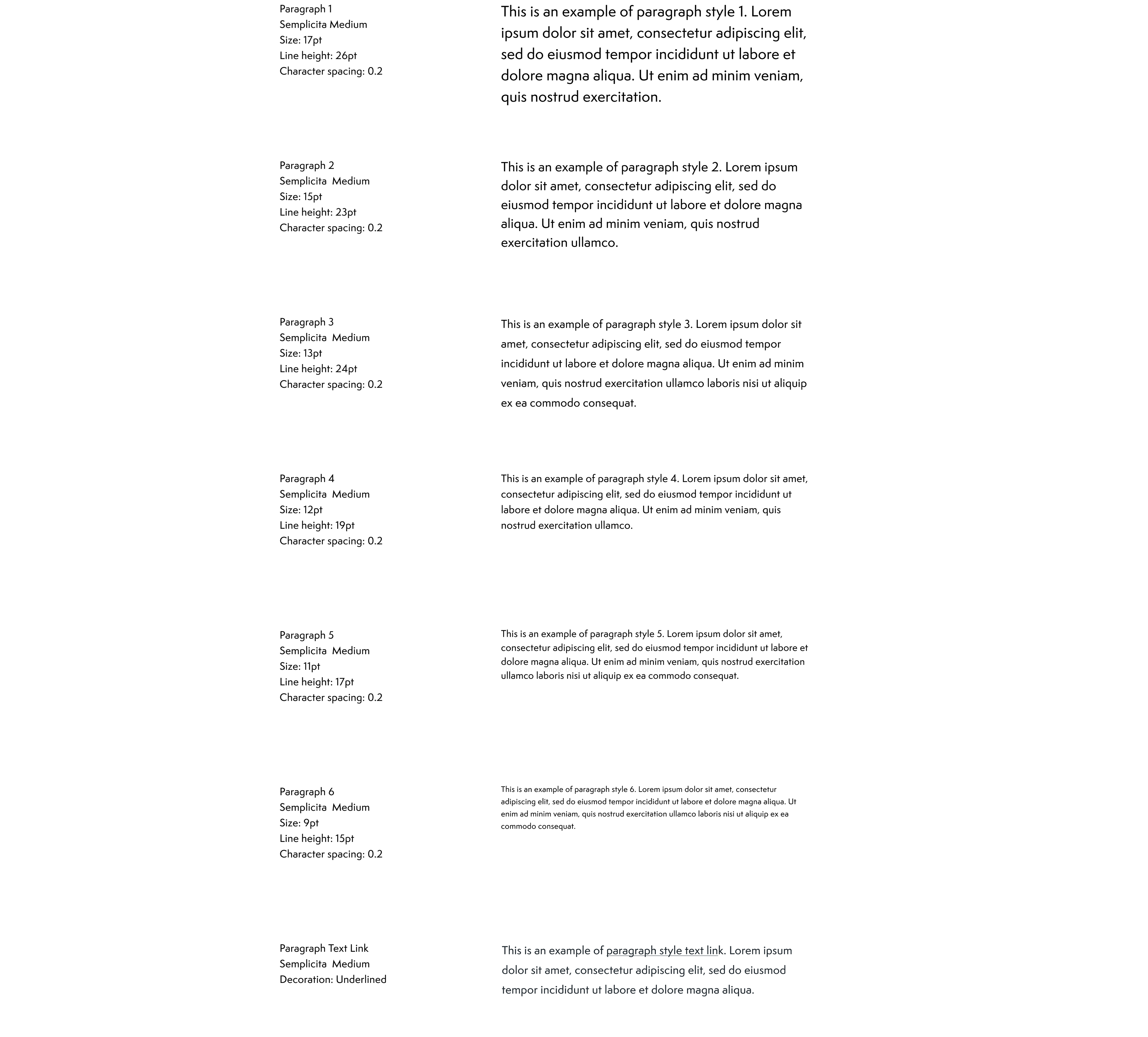
One of the biggest tasks of the project was to move away from using Futura as the typeface on digital platforms, and find a suitable replacement for the brand.
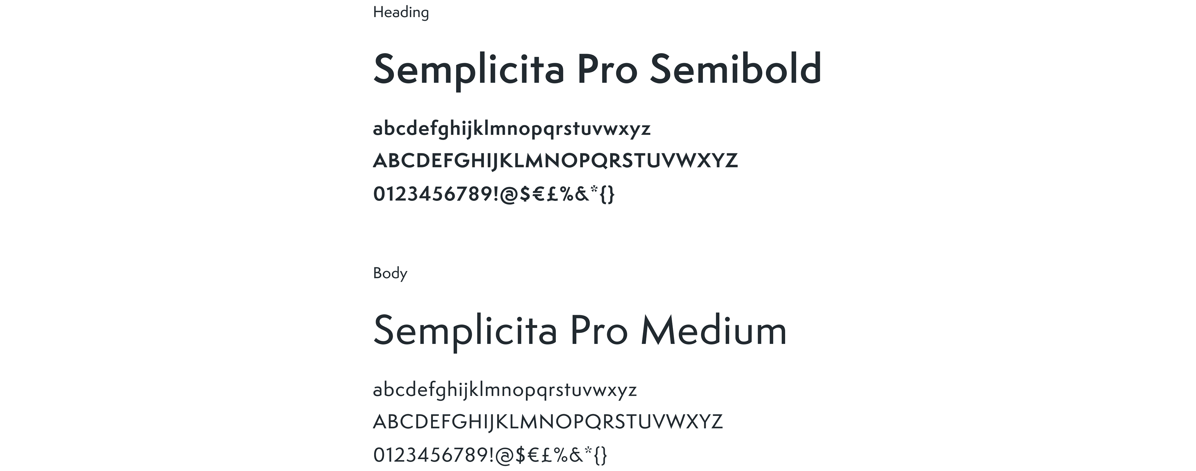
I defined type size, line-height, weight and character spacing for each heading and paragraph style.
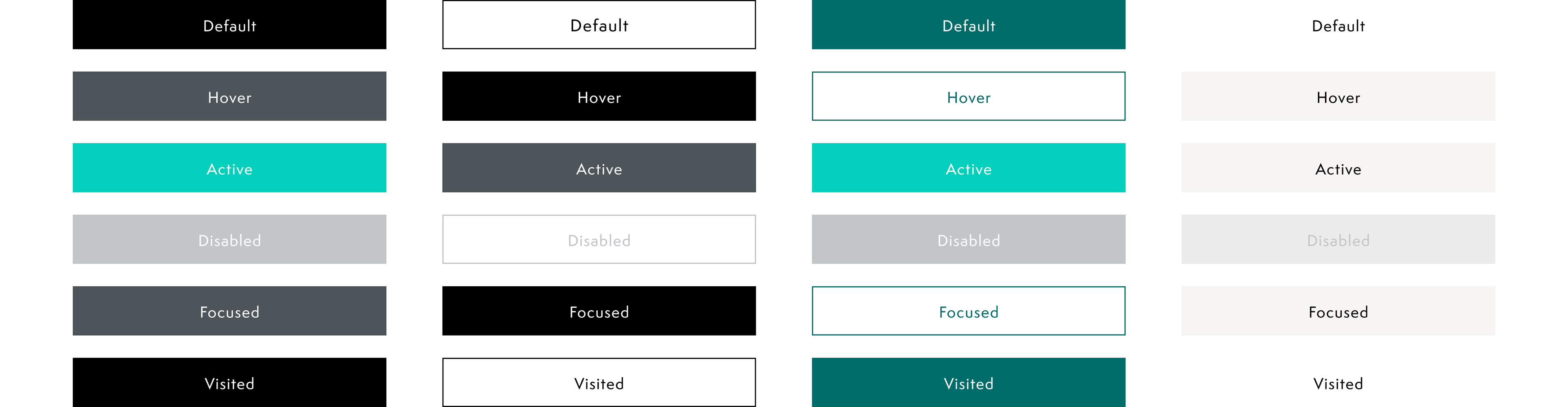
buttons
I designed primary, secondary and tertiary button styles, along with their corresponding states. I set a minimum width and height, based on mobile best-practices, along with rules for the inclusion of icons, and interaction animation.
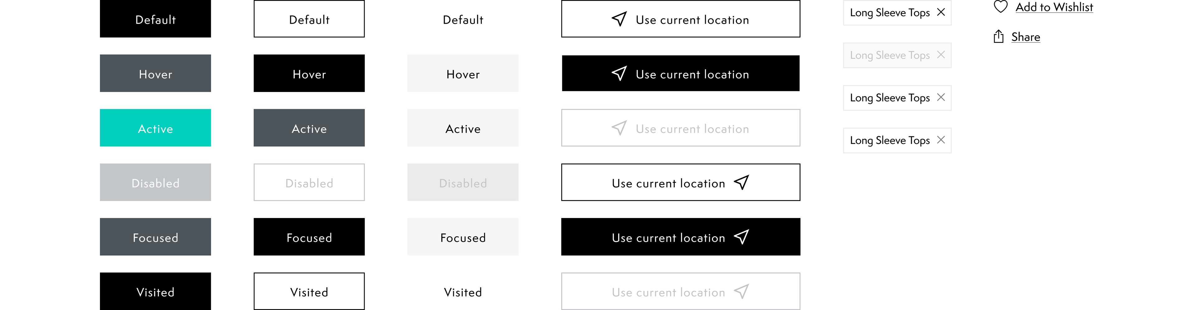
icons
These are some of the icons that I designed for the first phases of the design system.

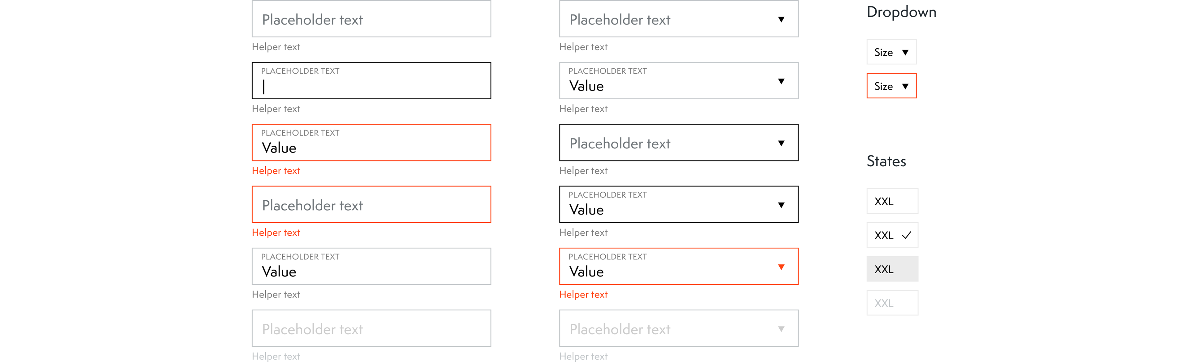
forms
Design of input fields, dropdown forms, and all the different scenario states.
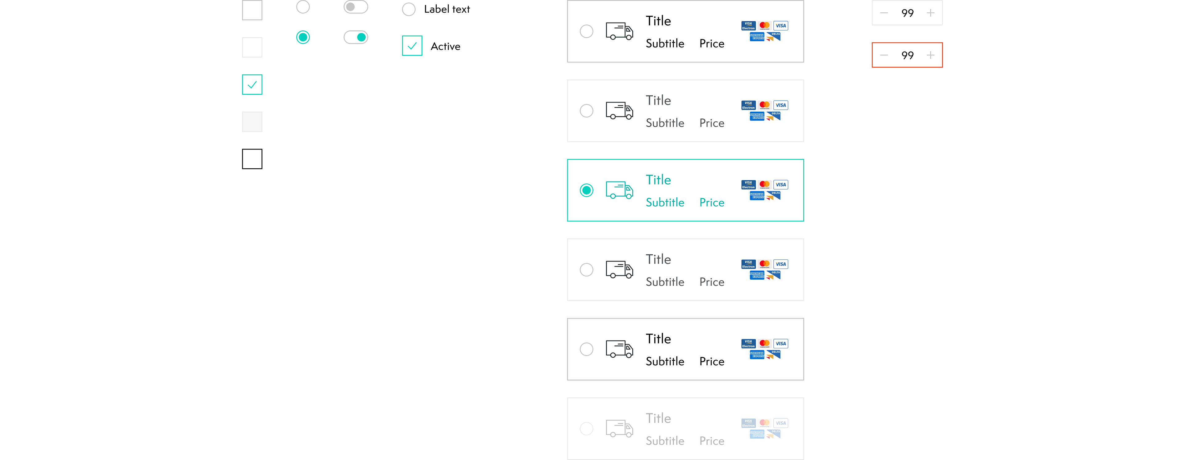
additional inputs
Design of radio buttons, toggles, checkboxes and quantity selectors.
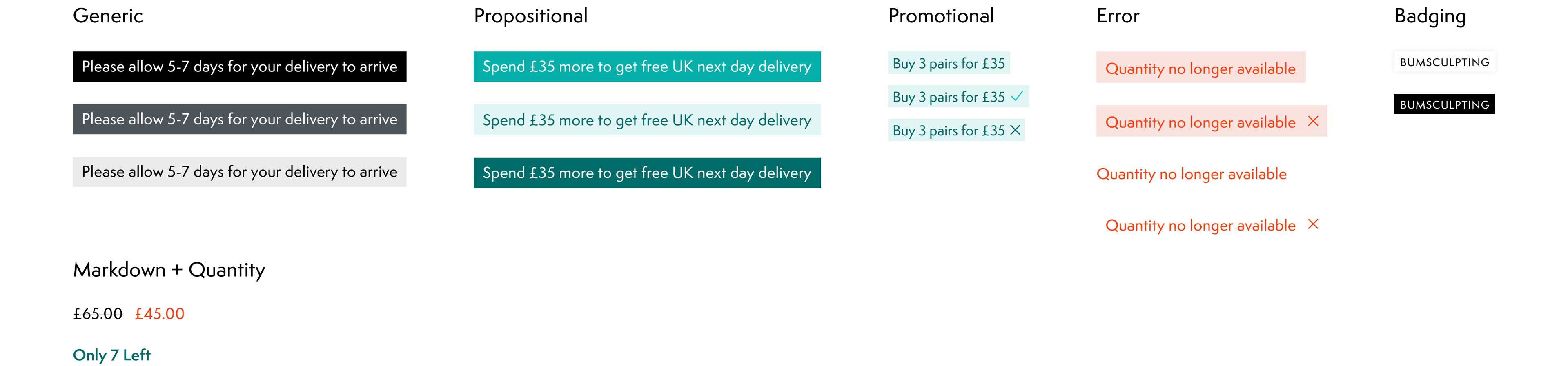
I designed and set rules for the treatment of generic messaging, propositional messaging, and different states for promotional and error messaging.
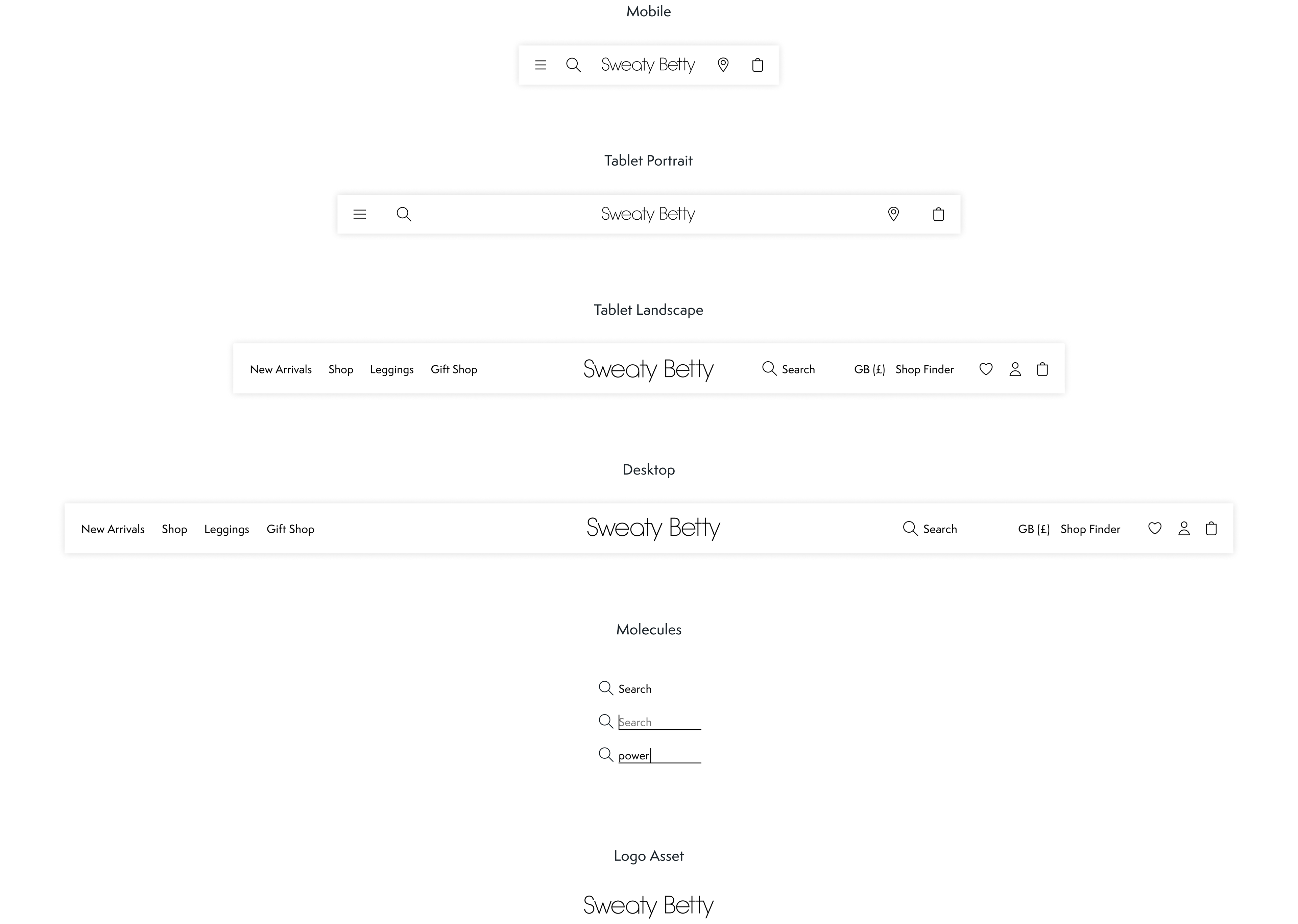
navigation
I designed the update to the new site menu header (top navigation). This included the new icons, which were carefully measured and scaled in the space.
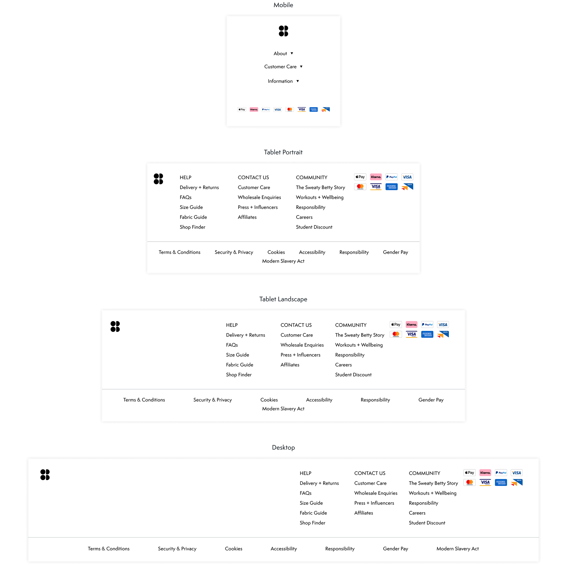
footer
We updated the icon in the footer to black (from fluro-orange), and streamlined the design of the footer.
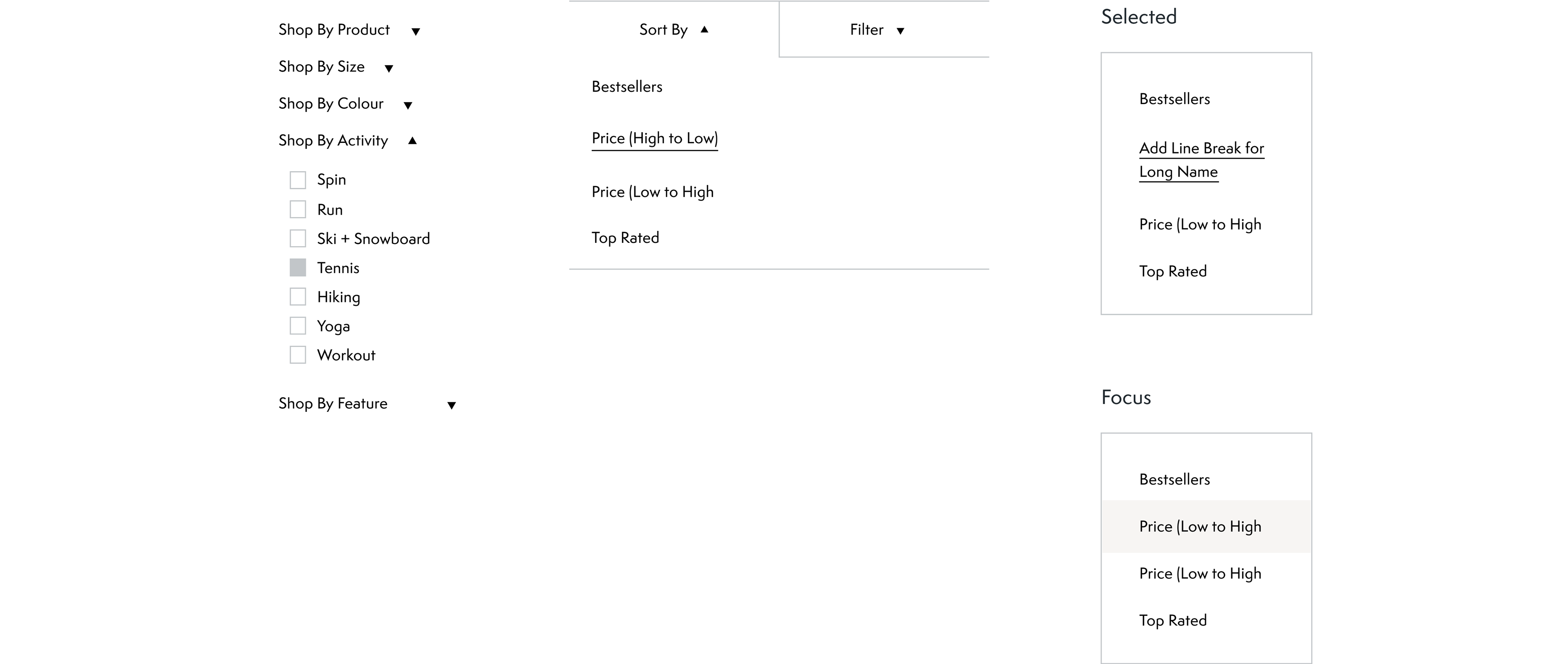
filtering
Dropdowns and tab design