the challenge
Smile Plastics was rebranding to Smile Materials to reflect a broader product offering, but their existing website was built solely around the original brand and couldn’t scale. The site architecture was rigid, making it hard to add or remove product categories without breaking the structure. The user journey was unclear, with key actions, like ordering samples, confusing or hard to complete. A new, flexible architecture was needed to support future growth and improve overall usability.
discovery and research
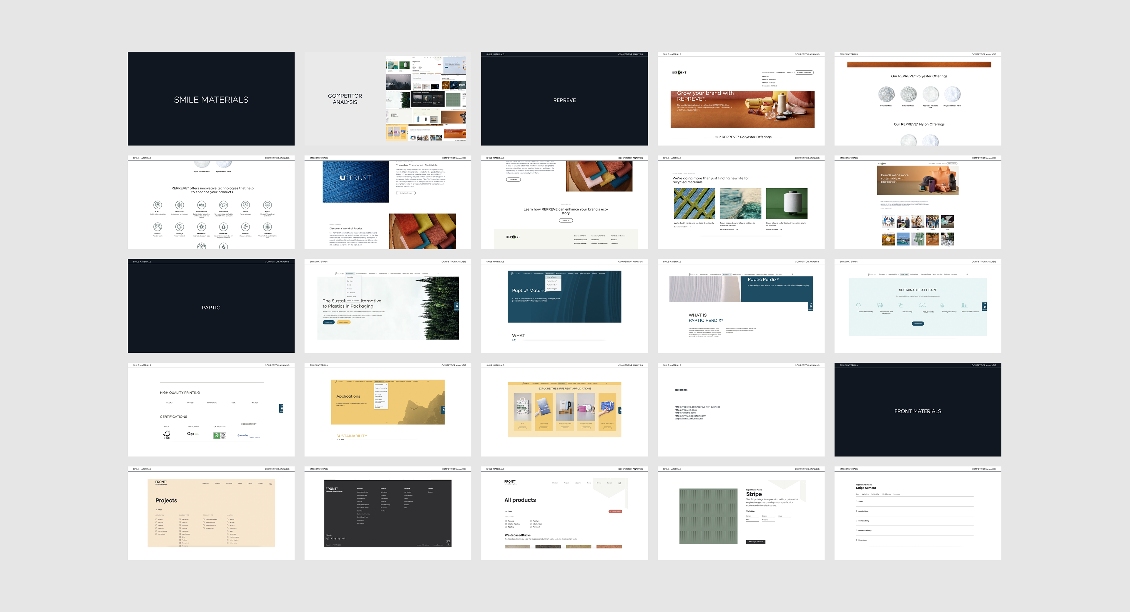
I began by reviewing Smile's brand evolution documents to understand their history, brand development, and strategic plans for global and product expansion. I then conducted a competitor analysis, focusing on businesses with similar models, particularly those in e-commerce and recycled materials with diverse product applications. From this research, I identified key insights and considerations to inform the structure of the top-level navigation.
In parallel, I collaborated with a data analyst to review site analytics and uncover content performance trends, allowing us to prioritise pages and features based on real user behaviour.
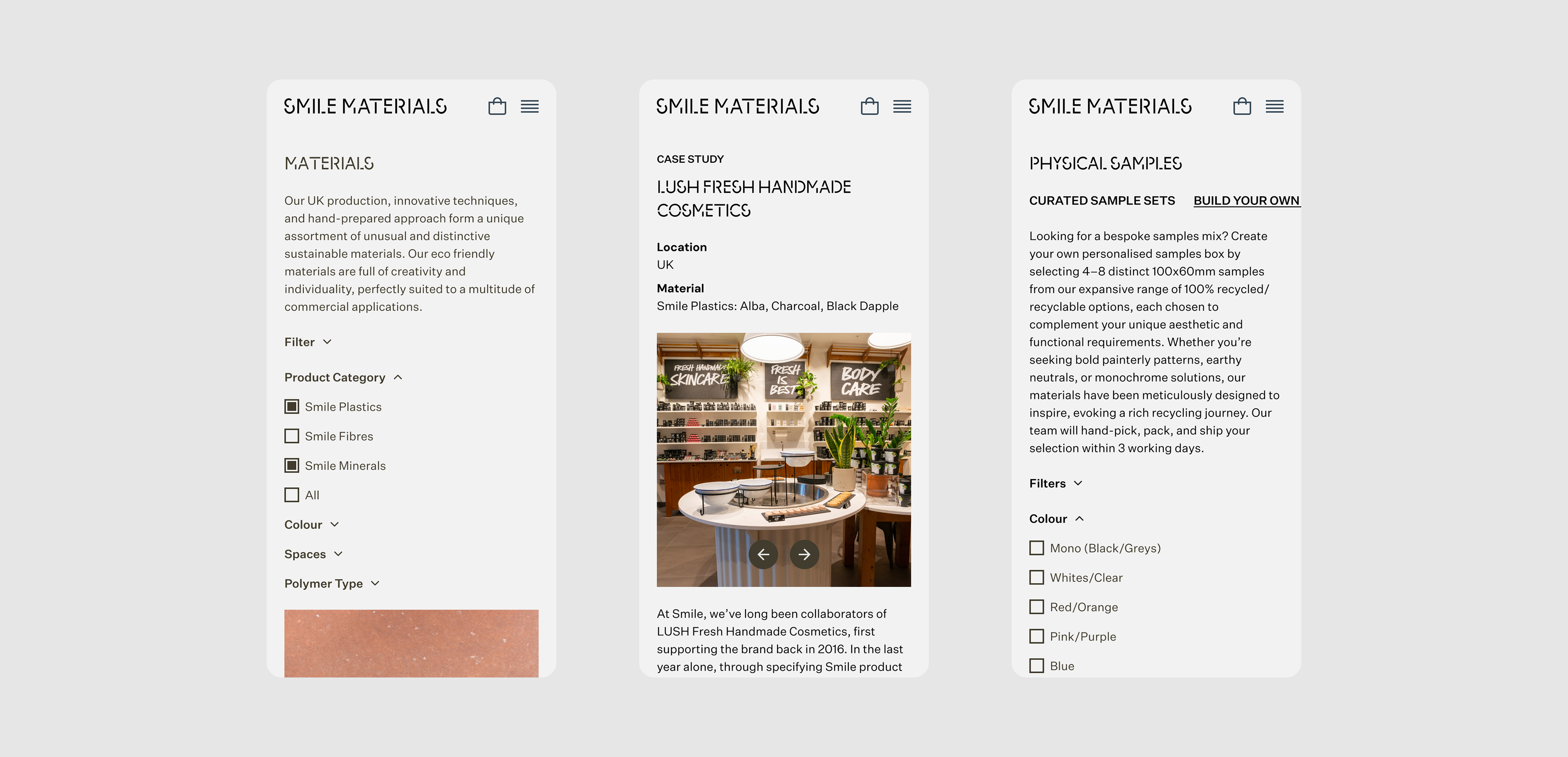
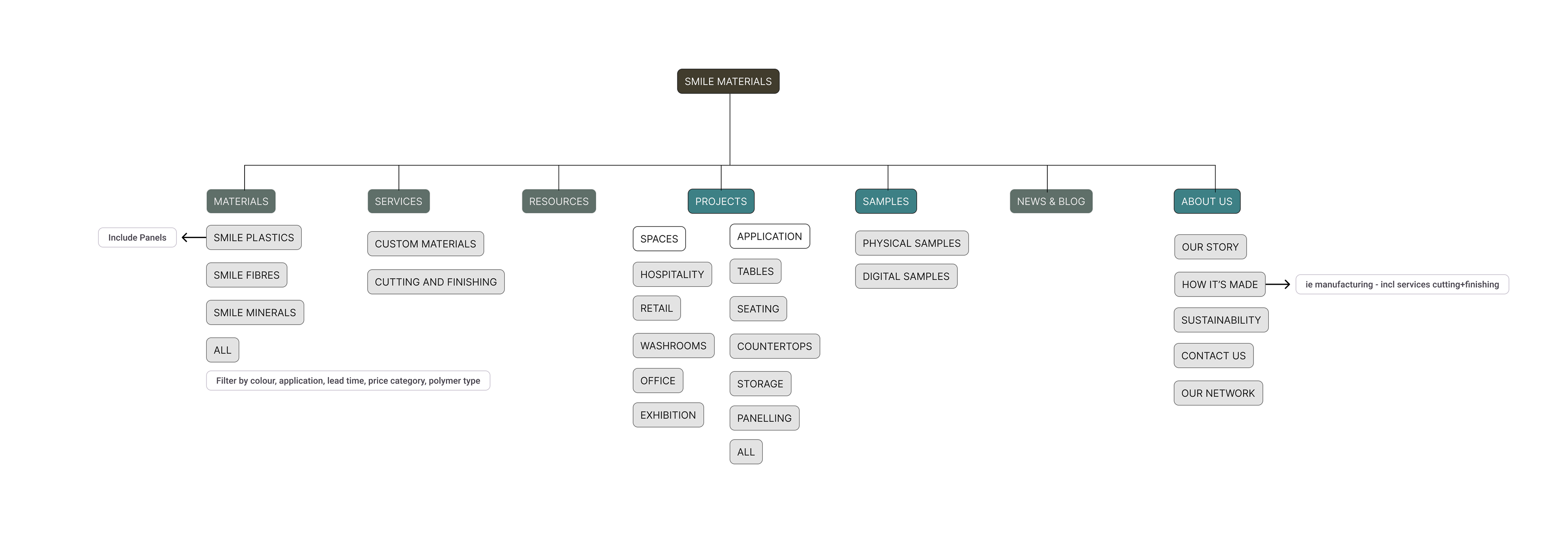
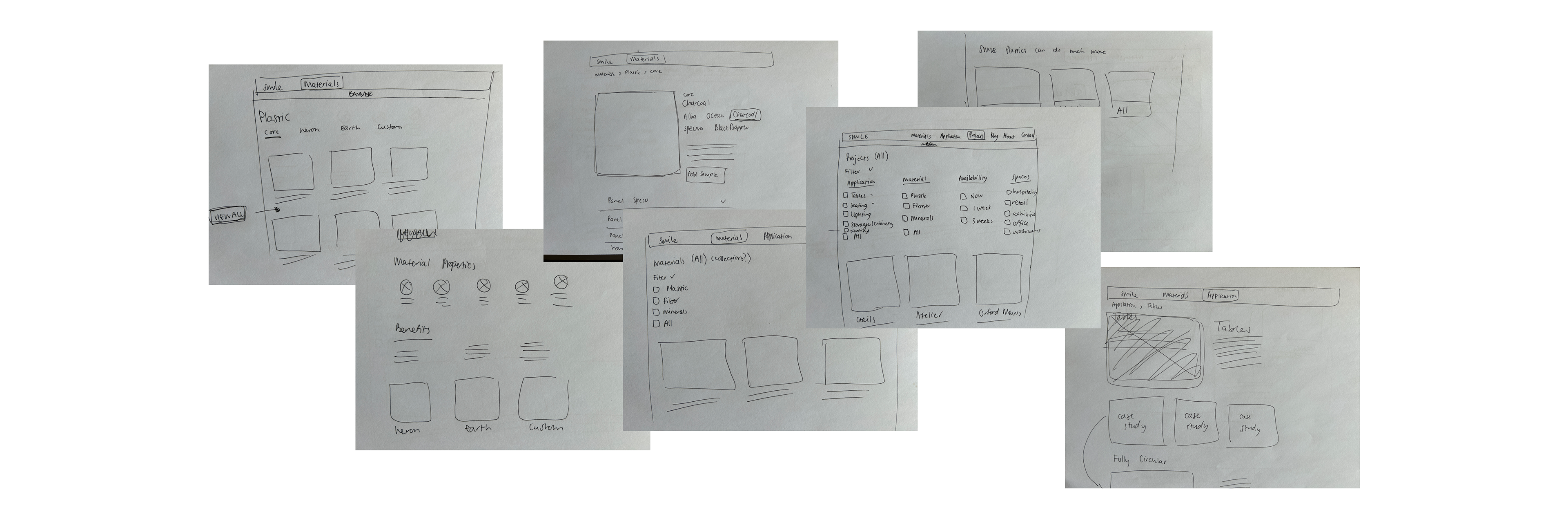
Drawing on all of this, I developed a proposed information architecture and top-level navigation strategy, which I presented to the business. After several rounds of feedback and iteration, I translated the final structure into low-fidelity sketches to explore layout and flow. Once the user journey and structure felt solid, I created digital wireframes and presented them to stakeholders for further validation and input.
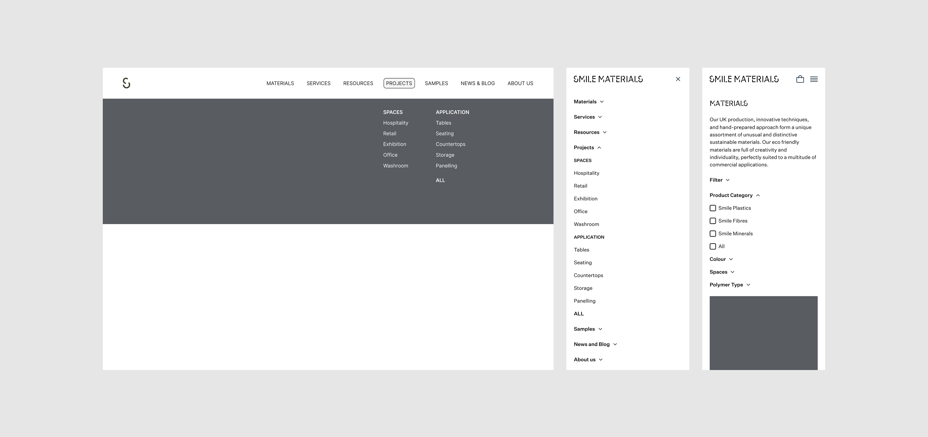

Once the navigation and wireframes across the full user journey were finalised, I began building the design system, which would serve as the foundation for the high-fidelity screens.
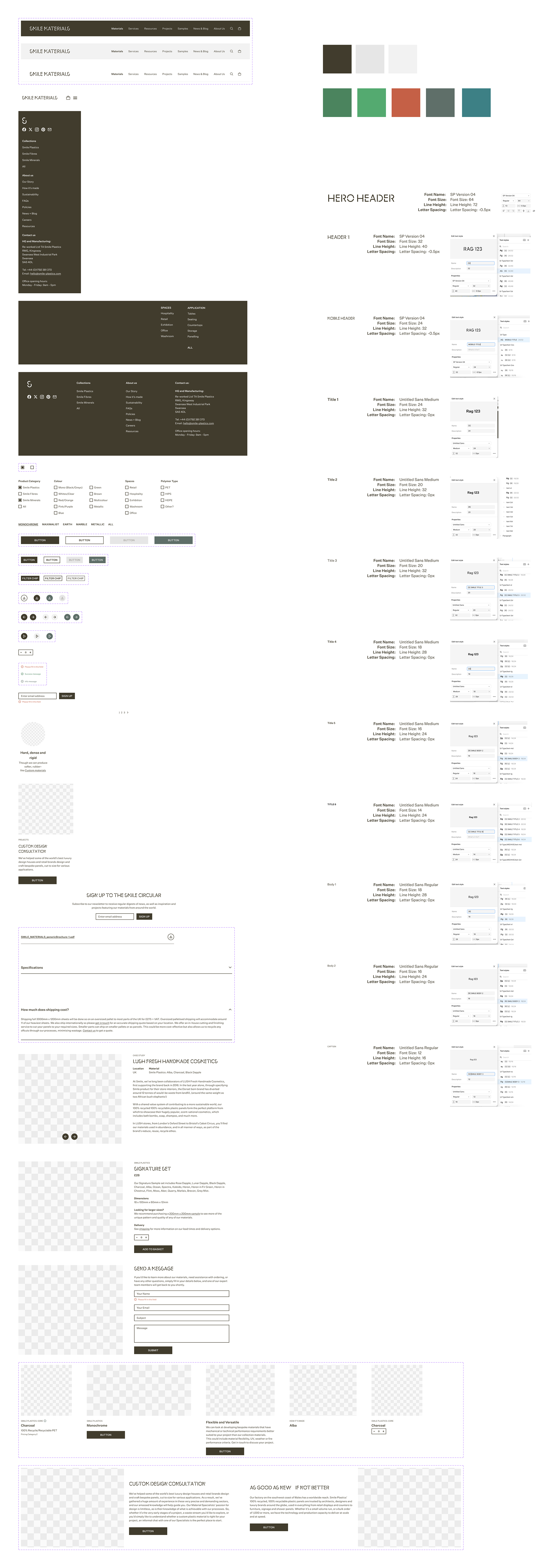
design system
Using the Atomic Design methodology, I translated the brand's visual identity into a cohesive system of foundations, components, and templates. I carefully aligned colour usage with the brand palette while making necessary adjustments to meet accessibility standards, ensuring semantic colours were both inclusive and visually consistent with the brand.
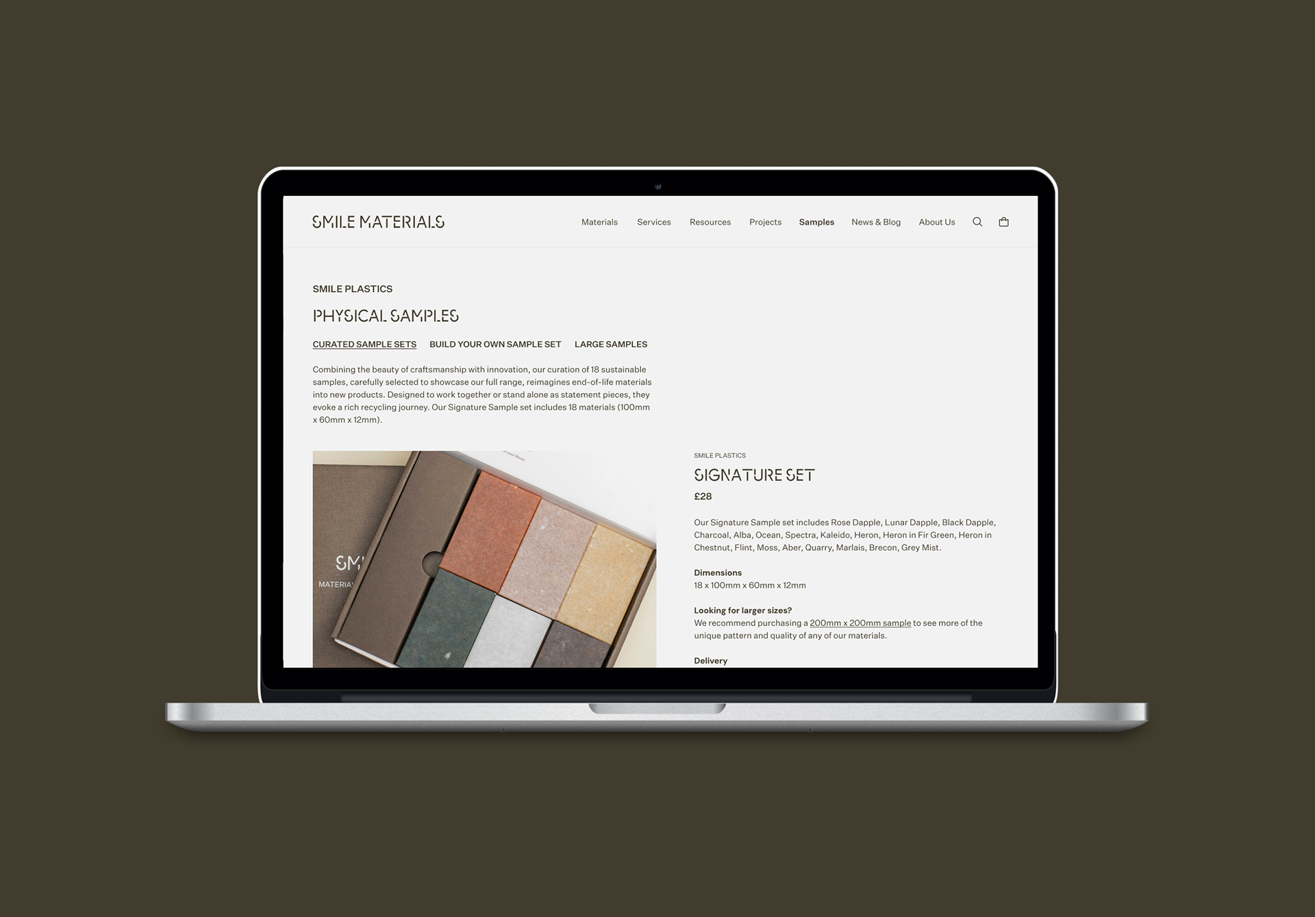
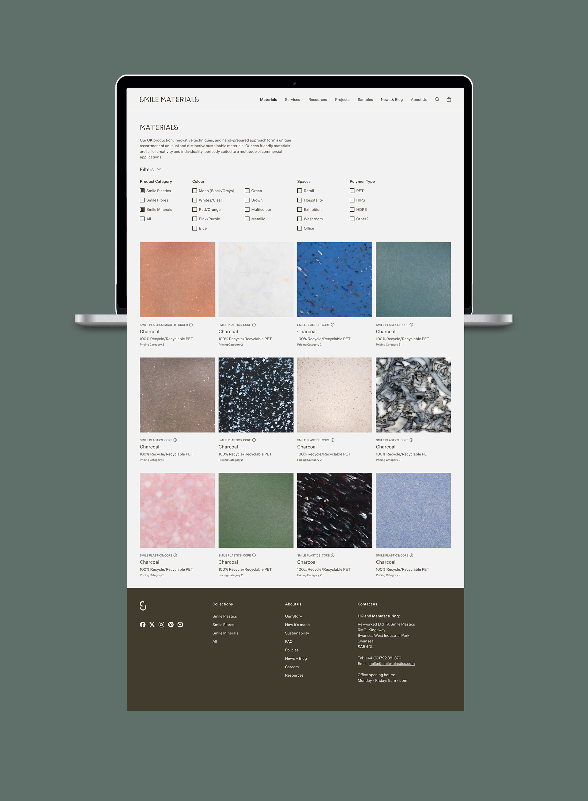
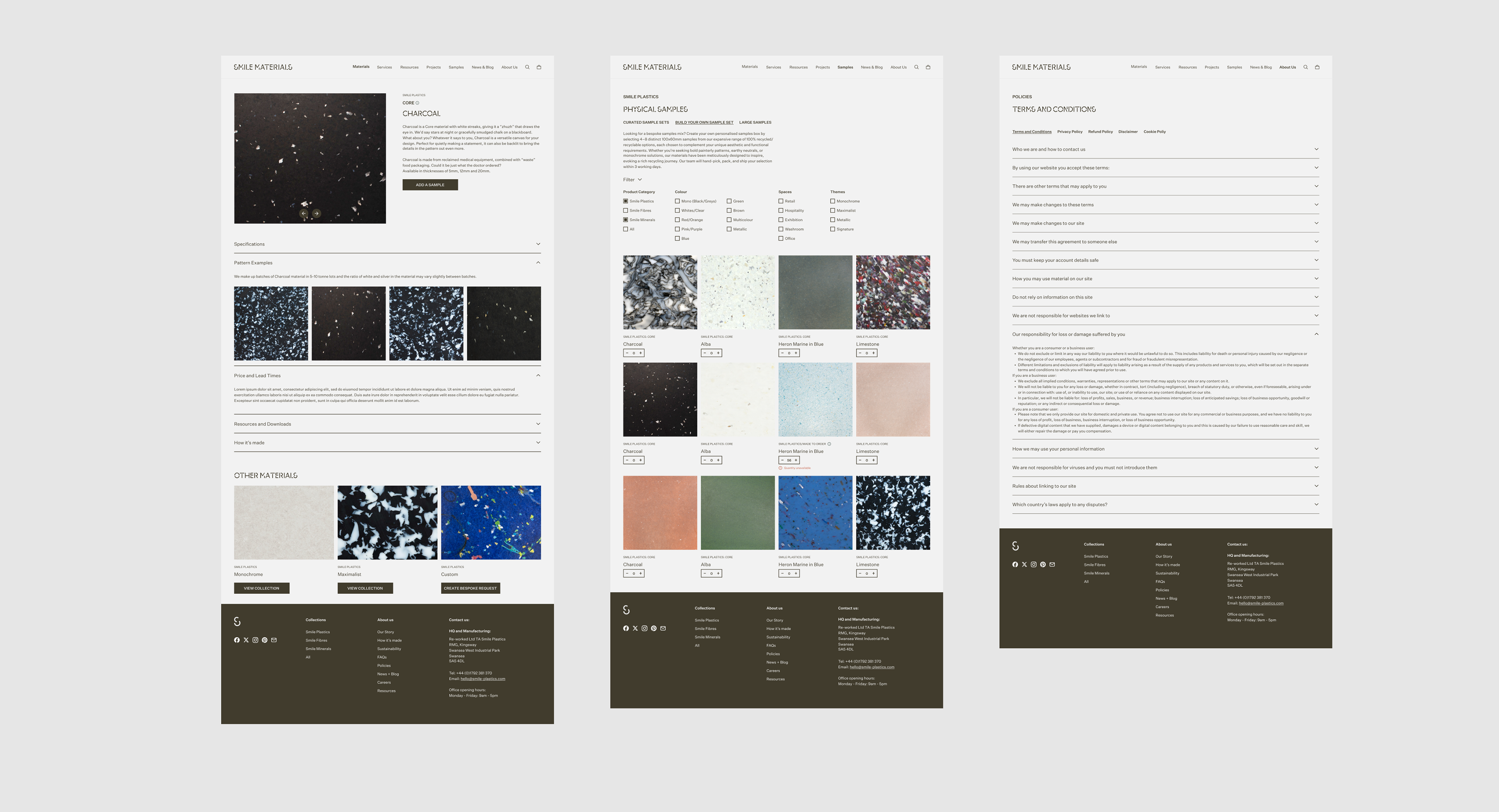
final design
After the design system received approval, I progressed to creating the high-fidelity screens. This phase involved several rounds of stakeholder feedback, as new requirements emerged. As a result, the user flow and navigation were refined and updated to align with these evolving needs.